ALL JAPAN competition. Sportswear Collection. Grafitti Artist: Sofia Maldonado
 customer profile/mood board
 photoshop-ped/illustrator-ed backround
final presented illustration w swatches!-sorry for the low res-
final!
sent to the competition... agh.. it was unexplored ground!
My teacher actually gave me VERY interesting comments on it:
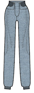
"Zaida, this is a very interesting piece of work. You do well with a touch of fantasy in your illustrative style, it fits your sensibility. There is a touch of whimsy and fantasy, which I think you should explore further for your eveningwear project, and even possibly your lingerie project. You should do some research into fantasy artists, of which there are many, as I think what you are doing is a fashion version of fantasy illustration. You should also explore this aesthetic choice digitally, as it would work with all sorts of Photoshop effects also. Your choice of background echoes your foreground beautifully, but doesn’t overwhelm it due to its rather muted nature and low pixel count. I am not normally a fan of low resolution images, but in this instance it works (this was NOT purposely done... guess I have to pay more attention to that). Your poses are fun and playful and I think this was the perfect opportunity to work with that. You also echo your theme very nicely with the figures holding a spray can. I particularly like that you didn’t overkill by giving each model a can, but left one without. The shoes are a bit on the tiny side in terms of scale on the first model on the left, and the spray paints possibly just a tad on the large side. The figure in the centre has a rather oddly placed centre of gravity. You have the back foot as the one taking the weight, but the foot is off the ground which makes this unlikely, but you body weight is placed directly in the middle indicating that the body weight is evenly distributed, but in fact it must be more on the front than the back. I think when I reviewed your figures you had a high heel on the back foot, making it possible that this foot had the main distribution of weight, but now without the heel and the foot raised off the ground, it couldn’t be the weight barer. The exaggerated pose of the figure on the right is fabulous with the exaggerated jutting hip on her left; anatomically impossible, but aesthetically very pleasing. The two pairs of jeans are fabulous designs, and clearly are reuse, redesign pieces, and the tops and dresses that complete your looks are just great designs and shapes. I would really have liked to have seen these pieces made up in fabric as I think that would pose an entirely different challenge for you, with quite possibly some changes being made as the patterns progressed. I love the bright, fantasy hair, which is your pop of color on an otherwise fairly monotone color palette. The pink shoes are also a lovely touch, adding some dimension. This is a great project Zaida, I look forward to seeing your next two. Well done!





 customer profile/mood board
 photoshop-ped/illustrator-ed backround


