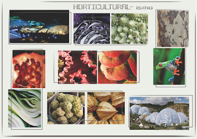
nonetheless.take a look at what the "final" presentation looked like.i say "final" because this is only what I PRINTED; add to it all the flat/technical drawings, the swatches(which make the book THICK AND EXCITING.
as i said on the first "topic-related post" i was not happy with the overall presentation of it and neither was Mrs. Field. she argued some of the pages were too much, backdrops and borders were NOT NECESSARY OR FLATERING AT ALL...and just in general that the presentation did not "add" to the designs. I was very dissapointed with this ed of semester just because I wasn't entirely HAPPY with any of my projects(and i didnt even get to FINISH all of them). I THINK they were GREAT IDEAS WITH LOADS OF POTENTIAL but for one or too many reasons(MILAN SUCKS being A MAIN ONE -more on that later-) they didnt make it to the finish line with my approval. in the end the most important thing- was to finish- and have something to show- even if that meant COMPROMISING.
maybe compromising since the beggining is the answer... but someone once told me that one of the most beautifull things about my way of thinking is " that i believe NOTHING IS IMPOSSIBLE"...
i'll figure it out... sooner rather than later I HOPE!
xxx enjoy!
cover


my owncomments:
-i like the INDIVIDUAL PIECES I DESIGNED, but they ooked a bit "forced into being together as color/texture groups".
-i wish my drawing was more "fluid" and clean.- not to have it look like a sticker or a marker illustration, but to be more precise/accurate, yet loose!
more to come... PLEASE COMMENT


No comments:
Post a Comment